7.1 Configuration service modifications
Code 1. Here a new component has been added to the properties component using the operational element <insert>
Step 1. Identify the properties component, and now make the modification in the xml file as shown below.
Properties Component Modification
As shown in the example above, instead of using extends, the configuration file has used modifies. This implies that properties configuration file has been modified to incorporate the change.
<insert> specifies the value that is to be inserted.
<insert path="contains">
Properties Component as seen in Webtop after Modification Code
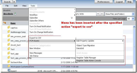
Code 2: In the menubar component, tools menu has been modified to add some more menu options. Here we will use < insertafter> operational element. <insertafter> operational element will insert the menu options after a specified action in the menu. Step 1. Identify the menubar file and menuconfigid that is to be modified
MenuBar File Modified for Tools Menu
Here menu modification will take place after the “export to CSV” action in tools menu as attribute „path‟ in <insertafter> specifies the path of “export to CSV” action. Step 2: To add the nls id‟d to menubar NLS modify the menubar_component.xml to point to the customized NLS
Modification of menubar to include customized NLS
Result in Webtop after modification
7.2 Right-click context menus
Code 1: For the documents, new menu options have been inserted in right menu. Step 1: To modify the right click menu, dm_sysobject_actions.xml has to be modified as context menu related to documents is defined in this file.
Context Menu modified to add new menu options
Here menuconfig has been modified to insert the menu options in context-menu. Step2: After addition of menu items, modify the NLS file. For right click menu, NLS strings are read from the component NLS file. That is the component from which actions of context menu are fired. For e.g., in above example, right menu has been modified for home cabinet datagrid, so NLS id‟s will be added to home cabinet NLS file. To change home cabinet NLS file, make the changes as shown.
Modify the component to include customized NLS file

Step 3: In the NLS file include the original hotkeys nls file and add your definition. NLS_INCLUDES=com.documentum.webcomponent.navigation.homecabinet.HomeCabinetListNlsProp,com.miti.menubar.MenuBarNlsProp
Result in Webtop after modification
7.3 Key-Board Shortcuts (hotkeys)
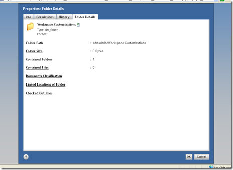
Code 1: For the component described above in properties component, a shortcut has been provided. Step 1: To provide a shortcut to an action, specify the attribute “hotkeyid” in the actionmenuitem. <actionmenuitem dynamic='singleselect' name='view_folderdetails' value='Folder Details' action='folderdetails' showifinvalid='false' showifdisabled='false' hotkeyid="HOTKEY_FOLDERDETAILS"/> Step 2: This id will be matched to the keynlsid key in hotkeys.xml. To insert a new hotkeyid in hotkeys.xml modify the hotkeys.xml file as shown below.
Addition of id and keynlsid in hotkeys.xml
Step 3: The NLS file for hotkeys which matches the keynlsid to shortcut keys is described in webcomponent/app.xml <hotkeys> <nlsbundle>com.documentum.webcomponent.keyboardshortcut.HotKeysNlsProp</nlsbundle> </hotkeys> To include the new NLS file as hotkeys.nlsbundle modify the app.xml file as
Modification of app.xml to include customized hotkeysNls file

Step 4:In the NLS file include the original hotkeys nls file and add your definition. NLS_INCLUDES=com.documentum.webcomponent.keyboardshortcut.HotKeysNlsProp _#HOTKEY_FOLDERDETAILS=F In <_#HOTKEY_FOLDERDETAILS=F> F represents the shortcut key that has been created for that action. So now on key press of F on selection of a folder, the component “Folder Details” will be launched.
In Webtop hotkey has been defined for the component
7.4 Presets
Code 1: Through the preset editor we will make following configurations for group in a particular repository
a) Reduce menu options so that user can not view properties from the menubar.
b) Only “dm_document” will be available as type to create a document.
c) Only one format is available to create the document
d) Only one workflow template is available to be attached to document
Step 1:Navigate to preset editor
Navigation
Preset Editor in Webtop
Step 2:Select the group
Group Selection
Repository selection
Step 4:Click on Next to define preset rules
Click on next in container to define preset rules
Rules Screen
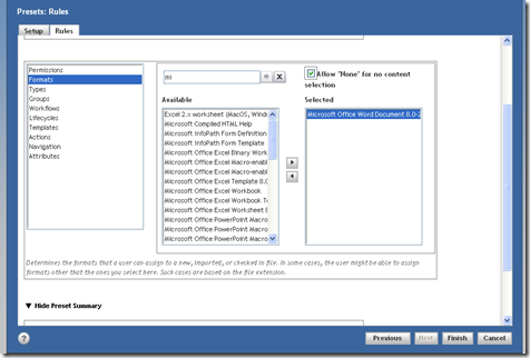
Step 5: Select the format which can be applied to the document at creation/import or checkin.
Format Selection
Step 6:Select the type which can be applied to a new/imported document.
Type Selection

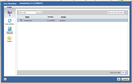
Step 7:Select the workflow which can be applied to the document.
Workflow template selection

Step 8:Select the Actions which will not be visible to the user. In the example View->Properties action has been excluded from the available actions.
Action Exclusion that is the items which will not be available in menubar
Preset Summary

Step 9:Click on OK to finalize the preset rule. Step 10: Login as the user who is a member of “clientgroup” and see the results.
Results in Webtop
Result 1 When the user tries to make new document, only dm_document is available as the document type, and only selected formats in preset can be chosen as shown in the figure below
Only one type and format is available for document creation
Result 2:In the menubar, View->Properties have been disabled
View-Properties is not accessible
Result 3: Only one workflow template is available to attach to the document.
Only one workflow template is available
Code 2: Through the preset, filter out the types that are available in advance search.
Step 1: To achieve this we need to modify the advance search configuration file as it define a parameter to enable the use of presets. Make the following modification Set the element usedocumentpresetfilter to true. <usedocumentpresetfilter>true</usedocumentpresetfilter>
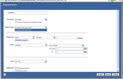
Step 2: Through the preset editor filter out the type that is to be made available in advance search screen. Now, if we take the example of the preset define in previous example, for user who is a member of “clientgroup”, advance search will show only dm_document as the type in advance search screen as this was only the selected type in above preset
Advance search screen showing only one type
7.5 AutoComplete
To set autocompletion in controls such as text, starts with filter, define the attribute “autocompleteid” in the control as shown below. <dmf:datacolumnbeginswith name='namecolumnbeginswith' column='object_name' autocompleteid='ac_namecolumnbeginswith' autocompleteenabled="true" size="24" nlsid="MSG_BEGINSWITH_FILTER"/> autocompleteenabled attribute is not necessary as it is true by default. Code : To enable autocompletion on the “starts with” filet on a datagrid. Define the autocomplete id in the startswith control as shown above. The datagrid will show the autocompletion in starts with filter as shown below. <dmf:datacolumnbeginswith name='namecolumnbeginswith' column='object_name' autocompleteid='ac_namecolumnbeginswith' autocompleteenabled="true" size="24" nlsid="MSG_BEGINSWITH_FILTER"/>
Autocomplete enabled in „starts with‟ filter
7.6 Starts with filter
This can be applied on the datagrids or datadropdownlist by definining the control <dmf:datacolumnbeginswith name='namecolumnbeginswith' column='object_name' autocompleteid='ac_namecolumnbeginswith' autocompleteenabled="true" size="24" nlsid="MSG_BEGINSWITH_FILTER"/> It can be used with datagrids as shown in the below code. <dmf:datagrid> <dmf:datacolumnbeginswith name='namecolumnbeginswith' column='object_name' autocompleteid='ac_namecolumnbeginswith' autocompleteenabled="true" size="24" nlsid="MSG_BEGINSWITH_FILTER"/> …… </dmf:datagid>
Starts with in Webtop
7.7 Subscription
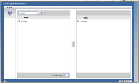
Any user can subscribe an object for another user. Here a document has been subscribed by dmadmin user for reviewer as shown below.
Option to enable Subscribe Others in Webtop

Select the user for which the object is to be subscribed
Now when user “reviewer” logs in to the repository, the object will be seen in the user‟s subscription list.
User can see the object in his subscription list 
7.8 Export to CSV
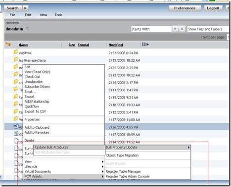
To export the metadata of the object to a csv file, select the object and on right-click, selet “export to csv”
Menu Selection
Select the columns to be exported
The excel file will be opened.
7.9 Read Notification
User can turn on the notification for an object, which will send the notification in his inbox and through mail whenever the document is read.
Menu Selection
Now when this document is viewed by any user, a notification will be received in the user‟s inbox who turned on the notification for this document.
Notification in Inbox 
7.10 Multi Objects Selection
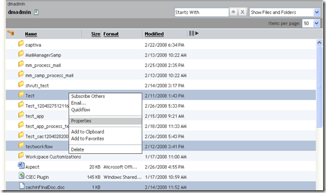
It is possible to define lifecycle, permissions and common properties to multiple objects at once. Select the multiple objects and on right-click select properties
Multiple Objects selection
The properties component will list the common editable properties, lifecycle/permission for the multiple objects.
Properties Component
7.11 Resizable Columns
To make the columns resizable define the header columns in datagrid as shown in the code below. <dmf:datagridTh cssclass='databoundExampleRowFont' resizable="true"> <dmf:datasortlink name='sortcol1' label='Object Name' column='object_name' mode='caseinstext'/> </dmf:datagridTh> <dmf:datagridTh cssclass='databoundExampleRowFont' resizable="true"> <dmf:datasortlink name='sortcol2' label='Object Type' column='r_object_type' mode='text'/> </dmf:datagridTh> For custom listing classes, that does not extend doclist, add the following method in your component implementation public void onInit(ArgumentList args) { ... initColumnWidths(); } protected void initColumnWidths() { //replace preference_id_string with string to persist the preference //replace CONTROL_GRID with datagrid ID m_widthsHelper = new DatagridColumnWidthPreferenceHelper( this, preference_id_string, CONTROL_GRID;
} private DatagridColumnWidthPreferenceHelper m_widthsHelper;
Result in Webtop
Columns Resized
7.12 Display the toolbar
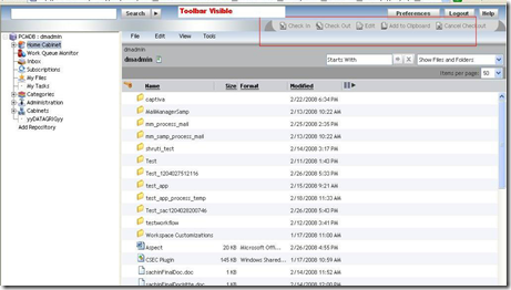
To display the toolbar modify the webtop/classic/classic.jsp In the jsp file, frame height of toolbar has been given as 0.Change the height of the toolbar frame and it will be visible. Make the following modification to classic.jsp in custom layer. Set String strRows = "0,*"; to String strRows = "22,*";












No comments:
Post a Comment