This document is intended to provide technical information and hands on experience with what is new in D6 WDK development. It provides a quick overview of the features that are new to Webtop/WDK for release 6.0, an introduction to the new deployment model, migration practices from 5.3 to 6.0, enable and configure new user interface features in customizations and the deprecated features of 5.3. This documentation will be useful both for administrators and developers.
Tuesday, February 10, 2009
Product Details
The Documentum Web Development Kit (WDK) is a Web application tool set. WDK architecture incorporates two models: a presentation model that uses JSP tag libraries to separate Web page design from behavior, and a component model that encapsulates repository functionality in configurable server-side components.
Webtop is an easy to use interface that allows users to access Documentum repositories and content management services within a standard browser application. Webtop is ideal for users particularly when content is accessed from remote locations across the Internet.
Installation
D6 has introduced a new deployment mechanism of Documentum clients. Instead of previous installation mechanism, no the war file have been created which simplifies and save time in installation.
Installation of Webtop 6SP1
1.1 Prerequisites
1. Preparing the Content Server
The content server must be first installed before installing Webtop6
2. Install required docbase if any.
For Webtop6, DocApps are provided in Content Server version 6. Content server automatically installs the required DocApps. For e.g., for using preset functionality a docapp needs to be installed which created the required roles and cabinets for preset.
3. The global registry requirement
A global registry of Content Server version 6 must be installed in the environment in order to run a WDK based application. A global registry is a central repository that serves several purposes. Content Server that has been designated as a global registry. Information from the dfc.properties file can be copied that was generated by the Content Server installer on global registry host. The generated dfc.properties file contains the connection broker address and the encrypted global registry user login information.
Note: WDK 5.3.x and 6 applications cannot share the same instance as a version 6 application on the same application one or both applications will not work properly.
4. Ensure that the client meets the requirement of browser and app server for installation of Webtop6.
1.2 Environment Supported
Webtop operates on a browser client and on a web application server. When the supported environments for the browser client and web application server are the same, they can be on the same machine. Otherwise, they need to be on different machines.
1.2.1 Browser environment
Users access Webtop through web browsers. The software environment consists of a specific combination of operating system, browser, and JRE. Webtop 6 supports windows/macintosh/linus/solaris browsers.
For detailed configuration refer to Webtop 6SP1 release notes.
1.2.2 Web application server environment
Webtop runs in a web application server environment. The web application server environment consists of a specific combination of operating system, web application server, and JDK. Webtop 6 runs on Apache Tomcat/BEA Weblogic/IBM Websphere etc.
For detailed configuration refer to Webtop 6SP1 release notes.
1.3 Installation Steps
1.3.1 Prepare the Browser
- Identify the browser and app server requirements.
- Ensuring a certified JVM on browser clients. Browser client hosts require a certified version of the Sun Java virtual machine (JVM or VM) to initiate content transfer in a WDK application. Browser requirement are described in detail in Webtop6 reference guide.
- Clearing the browser cache. Browsers cache JavaScript. Cached JavaScript in the browser from a 5.x WDK based application may cause errors when the user connects to a version 6 application. Clear the browser JavaScript cache to avoid these errors.
- Install the app server as detailed in app server guide.
1.3.2 Prepare the App Server
1. Identify the port that will host the appserver. Refer to app server guide for default port.
Make sure that the port does not conflict with any other service.
In this guide, installation will be shown on Apache Tomcat
2. Setting the Java memory allocation
The minimum recommended Sun Java memory allocation values for application servers
on a small system are the following:
-Xms1024m -Xmx1024m
3. Preparing Apache Tomcat
Disable tag reuse in Apache Tomcat in the web.xml file of the Tomcat /conf
directory. Find the JSP servlet entry in web.xml. Add the enablePooling initialization
parameter and set it to false:
<servlet>
<servletname>jsp</servletname>
<servletclass>org.apache.jasper.servlet.JspServlet</servletclass>
<initparam>
<paramname>enablePooling</paramname>
<paramvalue>false</paramvalue>
</initparam>
<initparam>
<paramname>fork</paramname>
<paramvalue>false</paramvalue>
</initparam>
<initparam>
<paramname>xpoweredBy</paramname>
<paramvalue>false</paramvalue>
</initparam>
<loadonstartup>3</loadonstartup>
</servlet>
1.3.3 Preparing the WAR file for deployment
To deploy a WDK based application
1. Download the WDK application WAR file from the EMC download site to a
temporary directory on the application server host.
2. Unpack the WAR file
War file is commonly downloaded from EMC as webtop.war.zip. Change the file
name to webtop.war
3. Deploy the war file according to the app server instructions.
4. For tomcat, start the server, and visit the Tomcat Manager
URL to access Tomcat manager is < http://localhost:8080/manager/html>
where localhost is the client hosting the app server and the 8080 is the port on
which service is listening.
- Deploy the war file as shown
Upload the war file and deploy the same.
- Modify the dfc.properties file as given
6.1.On the global registry repository host, locate the Content Server installation directory.
On Windows hosts, the default installation directory is C:\Documentum.
On UNIX hosts, this directory is specified by the environment
variable $DOCUMENTUM.
6.2. Open the file dfc.properties that is located in the config subdirectory.
6.3. Copy the following keys and their values from the file:
dfc.docbroker.host[0]=address
dfc.globalregistry.repository=repository_name
dfc.globalregistry.username=username
dfc.globalregistry.password=encrypted_password
6.4. Open the dfc.properties file located in WEB‑INF/classes within this expanded WAR
file directory.
6.5. Paste in the values that you copied from the global registry dfc.properties.
6.6. Save the dfc.properties file
Note: If you create a new WAR file from this application directory, you must ensure that any paths that you specify in dfc.properties are valid directories on the application server and that the application server instance owner has write permission on the specified directories.
- Test the application to verify the deployment.
Open the browser and type the URL <http://host_name:port_number/virtual_directory>
àhost_name is the host where the application server is installed. If the browser is on the application server machine, substitute localhost for host_name; for example, http://localhost:8080/webtop.
à port_number is the port where the application server listens for connections
à virtual_directory is the virtual directory for your application For example, if the application server host is named iris, the port is 8080, and the application virtual directory is webtop, the URL is http://iris:8080/webtop.
1.4 Troubleshooting
1.4.1 Tag pooling problem
If tag pooling is not properly disabled in the application server, you will see several instances of the same control on the login page
Caution: After you disable tag pooling, you must clear the cached JSP class files which still may contain pooled tags. Refer to your application server documentation to find the location of the generated class files. For example, Tomcat displays the following error message:
com.documentum.web.form.control.TagPoolingEnabledException:JSP tag pooling is not supported.
1.4.2 No connection to repository
If the application server log contains the following error during application initialization, it indicates that you have not specified a connection broker in the dfc.properties file of your application WAR file:
at org.apache.catalina.startup.Bootstrap.main(Bootstrap.java:432)
Caused by: DfDocbrokerException:: THREAD: main; MSG: DFC_DOCBROKER_REQUEST_FAILED] Request to Docbroker "10.8.3.21:1489" failed; ERRORCODE: ff; NEXT: null
1.4.3 Wrong JRE used for application server
If the application server host has multiple JREs on the system, the wrong JRE may be used by the application server. Check your application server documentation for instructions on using the correct JRE with your application server. For example, the Tomcat application server uses a JAVA_HOME environment variable. If this variable value is specified in the application startup batch file catalina.bat or in the service.bat file for Windows services.
The error that is displayed in Tomcat using the wrong JRE is the following:
ERROR [Thread1]
org.apache.catalina.core.ContainerBase.[Catalina].[localhost].[/webtop]
Error configuring application listener of class
com.documentum.web.env.NotificationManager
java.lang.UnsupportedClassVersionError:
com/documentum/web/env/NotificationManager
(Unsupported major.minor version 49.0)at
java.lang.ClassLoader.defineClass0(Native Method)
Configuration
1. Enabling DFC memory optimization
The DFC diagnostics are set to true by default. To free up memory resources,
Set dfc.diagnostics.resources.enable in dfc.properties. Add the following line to
dfc.properties file:
dfc.diagnostics.resources.enable=false
2. Enabling presets and preferences repositories
By default, presets and persistent preferences are stored in the global repository. For better performance, you should configure your application to use different repositories for presets and persistent preferences.
Add your preferences repository settings to app.xml in the /custom directory of the
application. Copy the entire <preferencesrepository> element from /wdk/app.xml into
/custom/app.xml and then specify your repository.
For more details on the configuration on different app servers refer to Webtop Deployment guide.
Migration details
Migration practices have been tested by migrating assets built on WDK 5.3 to WDK6.0.
WDK6.0 supports backward compatibility, thus causing no major problem during migration.
It has introduced many new features which have been explained in detail in later section, but it is better to get acquainted with all the features, to have their advantages and minimize the probability of error.
These assets could not use all the functionalities of WDK, so some of the modified/deprecated concepts might not be completely tested.
1.1 Migration Practices
- Take a backup of your customizations
- Uninstall WDK/Webtop 5.3 or any application using DFC 5.x if you are deploying the WDK/Webtop 6.0/6.0 SP1 on the same app server which hosted 5.3.
Note: Uninstaller currently does not cleanup the classpath. This is known problem with EMC.
Webtop 5.3 and Webtop6.0 are not supported on same app server instance. One or both application fails to load.
It is recommended to have a new instance of app server and install the client on fresh instance. If needed upgrade the appserver according to the environment supported as described above.
- Test your application.
- EMC recommends studying out the new features introduced in WDK, and then migrate your application.
Note: Features have been explained in the later section. In this section a brief description is provided.
- Install any docapp if required. Currently Documentum Application Installer 5.3 Sp5 will support the docapp archive installation in D6 repository.
Note: EMC has also introduced Composer tool which is built on Eclipse framework and has been developed to integrate the Docapp build and installation functionality. This can be also used to install the docapps.
- Make changes to custom/app.xml if any.
Changes may be required in app.xml, as some of the features have been deprecated and some have been added.
7. Add your customization to the custom folder. Test and fix the application.
1.2 Deprecated Features/Functionalities
- Streamline View : This feature is disabled by default. The functionality of streamline has been provided in right click menus. This view is supported for previous versions and can be made visible through app.xml changes.
To enable the same, make the following modification in custom/app.xml
<streamlineviewvisible>true</streamlineviewvisible>
To change the entrypoint in webtop to streamline, make the changes in main component.
Note: In D6, default main component has changed and is defined in mainex_component.xml. This component does not mention the entry page for streamline, so mention the path for streamline over here and change the entrypage to streamline.
- Themes : Documentum 6 introduces a new version of the documentum and high contrast themes. These themes enhance performance and maintainability, and provide additional “look and feel” benefits. In order to use any 5.3 theme, other than these, enable the same in aap.xml by uncommenting the theme. These themes on enabling may not carry new changes introduced in D6.
- Desupporting Content Transfer applet: The content transfer applet is no longer supported. It is recommended to upgrade custom applications to use the UCF file transfer utility. Even the Tag library for content transfer is also not supported anymore.
- Checkboxes removal: In Datagrids, selection of objects through checkbox has been changed to row selection. Though the datagrids ( that leverage ActionMultiSelect and ActionMultiSelectCheckBox control ),will be migrated easily, without any modification, the checkbox will not be visible. D6 supports backward compatibility and uses the same controls for row selection as previously used for checkbox. Some new controls have been introduced which may be used according to the application requirement. Datagrids that use generic checkbox may require some modification in jsp. It is also possible to enable the checkbox functionality which has been explained in later section.
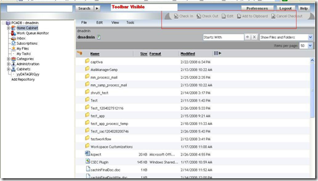
- Hidden Toolbar: Toolbar is no more made visible in D6. It still exists, but has been hiding, as all the functionalities now have been given through right click menu.
Apart from deprecated features, may more new features have been introduced and existing has been enhanced. Most of the features have been explained in detail in later section.
1.3 Issues faced in migrating the assets
- MenuBar
In the previous versions of webtop, menubar was placed in jsp file. But with D6 , menubar has been moved from jsp to configuration file.
Instead of copying the complete xml file, it is now possible to modify the xml file, thus inserting the customized menu options.
Step 1. Identify the menu file which defines the complete menu
Webcomponent/config/library/menubar/menubar_component.xml
Step 2. Identify the menu to be modified. In the assets , view menu was to be modified.
View menu is described in the element
<menuconfig id="menubar_view_menu">
Step 3. Modify the menu according to the modification process described in this guide
In later sections ‘New Features’ and ‘Sample Application’
Step 4. Save the file and restart the application.
- Login Component
Login component has been modified in WDK6 to give new look and feel.
Though WDK supported the 5.3 login component, but look and feel also changed to 5.3. To have the same login component as in D6 :
Step 1. Take a backup of your login .jsp
Step 2. Copy the wdk/system/login.jsp to your custom/login.jsp.
Step 3. Merge your custom jsp changes with custom/login.jsp.
Step 4. Save the file and refresh the application
Though WDK supports previous versions, it is better to migrate the application following the newer features introduced in WDK, as they will then maintain consistency and scalability.
New Features
In D6, WDK has introduced many new features/functionalities to give rich UI/better navigation and improved performances. D6 includes the following functionalities
- Configuration service modifications
- Right-click context menus
- Presets
- Field tab-through order configuration
- Auto complete
- Keyboard shortcuts
- Remove checkboxes
- Multi-object select (ACLs, Properties, Lifecycles)
- Assigning relationships
- Emphasizing lifecycles
- Dynamic filters (e.g., Starts With)
New Webtop Interface
1.1 Configuration service modifications
D6 has introduced a new concept of merging the XML file, rather than extending the file. In earlier versions to make any change in the component, it was required to extend the configuration file and then make the necessary changes. Even to insert one argument, it was required to copy all the arguments. This made applications brittle and difficult to maintain during upgrade. Each customized application essentially required its own WDK stack.
Now, In D6 it is possible to modify the configuration file rather than override it. This mechanism insulates the custom application from upgrades and allows the developer to modify additions made at any level in the configuration hierarchy. That is, if an element is defined in WDK layer and custom application needs to modify that element, than modify the configuration file at WDK layer. It is possible to modify a component definition to add, remove, or replace parts of the WDK component definition. The element to be modified can be component/action/application/menuconfigid etc.
Syntax for modification of file is
<config>
<scope scopename=scopevalue>
<primaryelement modifies="[primaryelementid:]configfile| [primaryelementid:]scopeclause">
<insert [path=elementpath]>
<element></element>
</insert>
<insertafter path=elementpath>
<element></element>
</insertafter>
<insertbefore path=elementpath>
<element></element>
</insertbefore>
<replace path=elementpath>
<element></element>
</replace>
<remove path=elementpath/>
</primaryelement>
</scope>
</config>
Here path specifies the place where the value is to be inserted. The path is relative to the primary element using dot notation and should locate a unique element in configuration file.
The following modifications can be made on the referenced configuration definition: insert,
| Configuring WDK Applications
| Operation element Description
|
| <insert> | Inserts one or more elements at the end of the referenced element’s children. If no path is defined, the specified elements are inserted at the end of the specified primary element’s children. |
| <insertbefore> | Inserts one or more elements before the referenced element |
| <insertafter> | Inserts one or more elements after the referenced element |
| <replace> | Replaces the referenced element with the specified element(s) |
| <remove> | Hides the referenced element from the current Scope |
The operational element has been described as examples in sample application.
1.2 Right-click context menus
Webtop D6 provides access to commonly used commands via a context menu available on the right click of object. D6 has introduced this functionality similar to Streamline view and toolbar. D6 has removed the checkboxex and has enabled the row selection. Context menus work in datagrids configured for row selection. Context menus are defined in the <menuconfig > element of an action configuration file. That is, the actions that are to be made available on right click of folder are defined in dm_folder_actions.xml. Similarly for all the types, corresponding context menu has been defined in their action file.
In action file under <menuconfig >, <actionmenuitem> identifies an action that can be performed on the object type that is specified in the scope of the configuration file. It is possible to disable row selection for complete application by making changes in app.xml. To do this, set the value of <richui> element to false.
<desktopui>
<datagrid>
<richui>false</richui>
</datagrid>
</desktopui>
It is also possible to disable the row selection mode only for selected datagrid. This is explained in sample application.
1.3 Key-Board Shortcuts (hotkeys)
D6 has introduced the concept of hotkeys which provides a new mechanism for users to activate commands using the keyboard. Hotkeys are supported for the following controls:
• button
• link
• menuitem
• actionbutton
• actionlink
• actionmenuitem
• actionimage
Custom controls that extend these control tags inherit hotkey support if they add the appropriate
attributes to the tag library. Hotkeys are enabled by default. To disable hotkeys for entire application, make changes in app.xml. Set the value of <enabled> element to false.
<hotkeys>
<enabled>false</enabled>
</hotkeys>
For configuring a hotkey on individual control, refer to Sample application.
1.4 Presets
WDK 6 has come up with a new feature called “Presets”. This is an important and useful feature. A preset determines the selections or actions available in particular situations. Presets allow user to configure menu /format/type /lifecycle/workflow selection for different users, groups, roles or location. The item or set of items is called the preset’s scope. Creating a preset offers a way to reduce screen options to those options that are relevant to the user’s task in the particular situation. A preset is assigned to a particular item or set of items.
This feature has reduced the need of customizing the application on different scopes. For e.g. you what to display one menu to administrator, one to users and one to users working in particular cabinet. To this previously it was required to build the same component according to different scopes. Now it is possible to build one component and then enable/disable it according to the scopes defined through Preset editor.
Presets are created in webtop through Preset Editor. Navigate to Administration/Preset Editor.
To give users the ability to create presets using the presets editor, assign those users the role
dmc_wdk_presets_coordinator. This role is auto created in repository at the time of installation of content server. The WDK Docapp creates a presets folder, owner, and permission set. The presets folder is /Resources/Registry/Presets/Webtop. The owner of the presets folder is the user dmc_wdk_presets_owner. The folder is assigned the permission set ACL dmc_wdk_presets_acl.
Advantages of using Preset:
Ø Configurable context-based availability of actions, menus, workflows, permissions, auto-attributing, etc.
Ø Based on users, groups, roles, locations, applications
Ø Presets are set at runtime by the business user.
Presets can be disabled for an application by making the following change in xml
<presets>
<filter clientenv='not portal'>
<enabled>true</enabled>
</filter>
</presets>
Preset can also be added to component definition to specify the configuration element that should be user configurable through the presets editor. For example, the checkin component definition adds a format filter item to the definition as follows:
<preset_item id="format_filter">
<selection>
<entries>
<entry></entry>
</entries>
</selection>
</preset_item>
If the user’s context matches the scope of a preset (custom setting) that contains the format filter, then the user will see only the available formats for that preset definition.
Preset has been further described with an example in sample application.
Webtop installs a preset called Webtop Express preset at the time of Content server installation.
The Webtop Express preset is intended for users who need only limited access to repositories. This preset is scoped for the users who are defined in express_user role. Administrators who belong to the dmc_wdk_presets_coordinator role can edit the Webtop Express preset.
1.5 Field tab-through order configuration
WDK supports the tabindex HTML attribute to determine order in which controls will be navigated with the Tab key between form fields and other UI elements in the browser.
For example, a given form may support a business process in which the user wants to tab vertically through multiple fields. A different form may require tabbing horizontally through a set of fields. In compliance with the HTML 4.01 specification, WDK will generate a tabindex attribute on HTML elements that overrides this default behavior.
It is possible to turn on/off tabindex support for given environments in app.xml
<tab_ordering>
<filter clientenv='not portal' >
<enabled>true</enabled>
</filter>
<filter clientenv='portal' >
<enabled>false</enabled>
</filter>
</tab_ordering>
1.6 AutoComplete
Autocompletion for attribute controls is supported for drop-down list and text controls. Value
assistance is read from the data dictionary, and the completion list for open lists is stored in the
repository by attribute name for each user and is not specific to object type or repository.
Autocompletion can be disabled for the entire application by making changes in app.xml as
<auto_complete>
<enabled>true</enabled>
</auto_complete>
Autocompletion can also be configured through preferences on user basis.
WDK describes the following attributes defined for control on which Autocompletion feature can be configured.
• autocompleteid
Key that is used to store the autocomplete list in the user preferences.
• autocompleteenabled
Boolean that enables or disables autocompletion on the control
• maxautocompletesuggestionsize
Specifies the number of matching suggestions to display to the user. Default = 10
Implementation is shown in Sample Application.
1.7 Starts With
Datagrid items can be filtered using the Starts with filter, which is generated by a datacolumnbeginswith control within a datagrid tag or within a datadropdownlist on the JSP page. Filtering is case insensitive by default.
1.8 Subscribing another user to a repository item
In D6 One user can subscribe another user to a repository item.
1.9 Export to .csv
It is now possible to export metadata about repository lists, including directory locations and search results. The information is saved as a .CSV file, which can be opened in Microsoft Excel or another editor.
1.10 Congurable read notications
A user can select any object in a list view and turn on read notification to notify the user when
the document has been read. The default event for notification is dm_getfile, and the minimum
permission for read notification is configured in webcomponent/app.xml.
<readnotification>
<event>dm_getfile</event>
<minpermit>read_permit</minpermit>
</readnotification>
1.11 Preferences persistence
WDK 6 provides a new server-based model for saving user preferences that reduces reliance on
cookies and provides portability of preferences. This improves reliability and keeps the user
experience consistent when using more than one client machine.
Preferences are stored for a user in repository that is configured in app.xml as
<preferencesrepository>.<repository>
For some of the configuration preference can be cookie only , that is not stored in repository, for e.g. Login cookies are used before the user’s preferences are downloaded from the preference repository, so they are specified as non repository preferences in app.xml.
<preferencesrepository>
<non_repository_preferences>
<preference>component[id=login].username</preference>
</ non_repository_preferences>
</preferencesrepository>
For information on configuring a preferences repository and non‑stored preferences, refer
Preferences are stored for the first username that the user uses to log into a repository. For example, if the user logs into the WDK‑based application with the user ID of kasanr and then logs into another repository as the user testuser, the user preferences are stored under the ID kasanr. The object in the preference repository will be kasanr.preferences. The preferences are stored as name/value pairs.
1.12 Lookup Methods
The configuration lookup methods lookupString, lookupInteger, and lookupBoolean have an
optional parameter consultPreference. Set to false to look up a configuration value from the
component definition and bypass a lookup of the user preference when the lookup is not needed.
1.13 Datagrid Enhancements
1.13.1 Row Selection
Users can now click rows to select objects rather than a checkbox at the left margin. This feature is enabled by default.
1.13.2 New Controls
New controls for better control and look of datagrid have been introduced like
a)datagridRowBreak- Specifies a break in a DatagridRow control.
b)datagridRowModifier- Hides or disables contained controls when its parent datagrid’s rowselection attribute is true.
c)datagridRowTd- Data cells in a datagrid control. Outputs <td> HTML tags with a marker class.
d)datagridTh- Column heads in a datagrid control. Outputs <th> HTML tags with a marker class and <div> HTML
tags that constrain each cell’s content.
1.13.3 Multiobject select
Users can shift-click to select contiguous rows or ctrl-click to create a discontiguous selection. ACLs, properties, and lifecycles can now be applied to several items at a time using multi‑object selection. By selecting multiple objects, WDK will show the common properties of the objects and will allow to select same lifecycle, permissions and properties to the object.
1.13.4 Resizable columns
User can resize the columns according to the requirements on the screen. To enable the column resizing user needs to add attribute ( resizable=”true”) for headers of columns
<dmf:datagridTh resizable="true">
. . .
</dmf:datagridTh>
1.13.5 Fixed column headers
Headings now stay in place while the user scrolls through the items in the datagrid. To enable this
behavior, custom components will need to implement header rows using the new element <dmf:datagrid fixedheaders=”true”>
…
</dmf:datagrid>
To globally disable fixed column headers, add the following element to /custom/app.xml:
<desktopui>
<datagrid>
<fixedheaders>false</fixedheaders>
</datagrid>
</desktopui>
1.14 Lifecycle enhancements
Lifecycle is now displayed on the Properties Screen (part of the default attribute set). Lifecycle Users are able to apply a lifecycle on documents at creation time (and Import, Create, Checkin), or later, via the Properties screen. The process of applying a lifecycle to a document has been enhanced to include the ability to specify the initial lifecycle state and the alias set. The current success/error messages for the lifecycle‑related actions displayed on the Message Bar that involve a lifecycle state change (Apply, Detach, Promote, Demote, Suspend and Resume) will be
enriched to contain pertinent information about the object lifecycle state (previous and current).
1.15 Assigning relationships
A user can create a relationship between any two documents in the repository. A relationship is a connection between two items in a repository. Relationships allow Webtop to process the items together. Relationships also allow users to access certain items by first accessing other related items. For example, if a document has been annotated by several reviewers and if each annotation has a relationship to the original document, a user can access the annotations by viewing the document’s relationships.
Invalid Actions hidden by default
The actions that are invalid can be made hidden for an application by defining
<display>
< hideinvalidactions >true</ hideinvalidactions >
</display>
In app.xml. This is by default true, that is, if the action is invalid it won’t be displayed even if the attribute showifinvalid is marked as true in control. It overrides the setting of control.
6.16 Search enhancements
Search functionality now includes the following:
• Savings the results for others to use
Last search results are saved and can be viewed by clicking on last results.
• Real time query monitoring (with ECI Webtop Extended Search option)
• Clustering results according to certain properties (with ECI Webtop Extended Searchoption)
• Ability to perform a combined database search on properties and full text searchon strings
• User interface enhancements
Monday, February 9, 2009
Sample Application
7.1 Configuration service modifications
Code 1. Here a new component has been added to the properties component using the operational element <insert>
Step 1. Identify the properties component, and now make the modification in the xml file as shown below.
Properties Component Modification
As shown in the example above, instead of using extends, the configuration file has used modifies. This implies that properties configuration file has been modified to incorporate the change.
<insert> specifies the value that is to be inserted.
<insert path="contains">
Properties Component as seen in Webtop after Modification Code
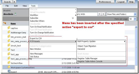
Code 2: In the menubar component, tools menu has been modified to add some more menu options. Here we will use < insertafter> operational element. <insertafter> operational element will insert the menu options after a specified action in the menu. Step 1. Identify the menubar file and menuconfigid that is to be modified
MenuBar File Modified for Tools Menu
Here menu modification will take place after the “export to CSV” action in tools menu as attribute „path‟ in <insertafter> specifies the path of “export to CSV” action. Step 2: To add the nls id‟d to menubar NLS modify the menubar_component.xml to point to the customized NLS
Modification of menubar to include customized NLS
Result in Webtop after modification
7.2 Right-click context menus
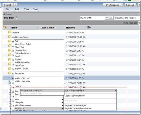
Code 1: For the documents, new menu options have been inserted in right menu. Step 1: To modify the right click menu, dm_sysobject_actions.xml has to be modified as context menu related to documents is defined in this file.
Context Menu modified to add new menu options
Here menuconfig has been modified to insert the menu options in context-menu. Step2: After addition of menu items, modify the NLS file. For right click menu, NLS strings are read from the component NLS file. That is the component from which actions of context menu are fired. For e.g., in above example, right menu has been modified for home cabinet datagrid, so NLS id‟s will be added to home cabinet NLS file. To change home cabinet NLS file, make the changes as shown.
Modify the component to include customized NLS file

Step 3: In the NLS file include the original hotkeys nls file and add your definition. NLS_INCLUDES=com.documentum.webcomponent.navigation.homecabinet.HomeCabinetListNlsProp,com.miti.menubar.MenuBarNlsProp
Result in Webtop after modification
7.3 Key-Board Shortcuts (hotkeys)
Code 1: For the component described above in properties component, a shortcut has been provided. Step 1: To provide a shortcut to an action, specify the attribute “hotkeyid” in the actionmenuitem. <actionmenuitem dynamic='singleselect' name='view_folderdetails' value='Folder Details' action='folderdetails' showifinvalid='false' showifdisabled='false' hotkeyid="HOTKEY_FOLDERDETAILS"/> Step 2: This id will be matched to the keynlsid key in hotkeys.xml. To insert a new hotkeyid in hotkeys.xml modify the hotkeys.xml file as shown below.
Addition of id and keynlsid in hotkeys.xml
Step 3: The NLS file for hotkeys which matches the keynlsid to shortcut keys is described in webcomponent/app.xml <hotkeys> <nlsbundle>com.documentum.webcomponent.keyboardshortcut.HotKeysNlsProp</nlsbundle> </hotkeys> To include the new NLS file as hotkeys.nlsbundle modify the app.xml file as
Modification of app.xml to include customized hotkeysNls file

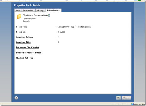
Step 4:In the NLS file include the original hotkeys nls file and add your definition. NLS_INCLUDES=com.documentum.webcomponent.keyboardshortcut.HotKeysNlsProp _#HOTKEY_FOLDERDETAILS=F In <_#HOTKEY_FOLDERDETAILS=F> F represents the shortcut key that has been created for that action. So now on key press of F on selection of a folder, the component “Folder Details” will be launched.
In Webtop hotkey has been defined for the component
7.4 Presets
Code 1: Through the preset editor we will make following configurations for group in a particular repository
a) Reduce menu options so that user can not view properties from the menubar.
b) Only “dm_document” will be available as type to create a document.
c) Only one format is available to create the document
d) Only one workflow template is available to be attached to document
Step 1:Navigate to preset editor
Navigation
Preset Editor in Webtop
Step 2:Select the group
Group Selection
Repository selection
Step 4:Click on Next to define preset rules
Click on next in container to define preset rules
Rules Screen
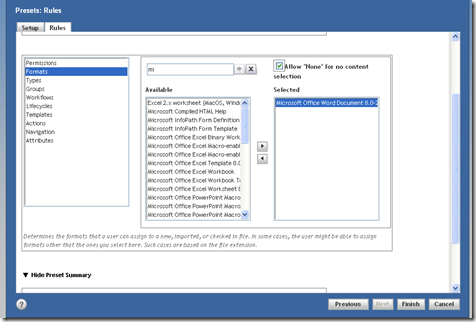
Step 5: Select the format which can be applied to the document at creation/import or checkin.
Format Selection
Step 6:Select the type which can be applied to a new/imported document.
Type Selection

Step 7:Select the workflow which can be applied to the document.
Workflow template selection

Step 8:Select the Actions which will not be visible to the user. In the example View->Properties action has been excluded from the available actions.
Action Exclusion that is the items which will not be available in menubar
Preset Summary

Step 9:Click on OK to finalize the preset rule. Step 10: Login as the user who is a member of “clientgroup” and see the results.
Results in Webtop
Result 1 When the user tries to make new document, only dm_document is available as the document type, and only selected formats in preset can be chosen as shown in the figure below
Only one type and format is available for document creation
Result 2:In the menubar, View->Properties have been disabled
View-Properties is not accessible
Result 3: Only one workflow template is available to attach to the document.
Only one workflow template is available
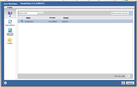
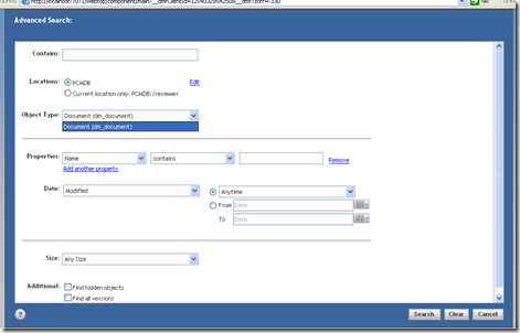
Code 2: Through the preset, filter out the types that are available in advance search.
Step 1: To achieve this we need to modify the advance search configuration file as it define a parameter to enable the use of presets. Make the following modification Set the element usedocumentpresetfilter to true. <usedocumentpresetfilter>true</usedocumentpresetfilter>
Step 2: Through the preset editor filter out the type that is to be made available in advance search screen. Now, if we take the example of the preset define in previous example, for user who is a member of “clientgroup”, advance search will show only dm_document as the type in advance search screen as this was only the selected type in above preset
Advance search screen showing only one type
7.5 AutoComplete
To set autocompletion in controls such as text, starts with filter, define the attribute “autocompleteid” in the control as shown below. <dmf:datacolumnbeginswith name='namecolumnbeginswith' column='object_name' autocompleteid='ac_namecolumnbeginswith' autocompleteenabled="true" size="24" nlsid="MSG_BEGINSWITH_FILTER"/> autocompleteenabled attribute is not necessary as it is true by default. Code : To enable autocompletion on the “starts with” filet on a datagrid. Define the autocomplete id in the startswith control as shown above. The datagrid will show the autocompletion in starts with filter as shown below. <dmf:datacolumnbeginswith name='namecolumnbeginswith' column='object_name' autocompleteid='ac_namecolumnbeginswith' autocompleteenabled="true" size="24" nlsid="MSG_BEGINSWITH_FILTER"/>
Autocomplete enabled in „starts with‟ filter
7.6 Starts with filter
This can be applied on the datagrids or datadropdownlist by definining the control <dmf:datacolumnbeginswith name='namecolumnbeginswith' column='object_name' autocompleteid='ac_namecolumnbeginswith' autocompleteenabled="true" size="24" nlsid="MSG_BEGINSWITH_FILTER"/> It can be used with datagrids as shown in the below code. <dmf:datagrid> <dmf:datacolumnbeginswith name='namecolumnbeginswith' column='object_name' autocompleteid='ac_namecolumnbeginswith' autocompleteenabled="true" size="24" nlsid="MSG_BEGINSWITH_FILTER"/> …… </dmf:datagid>
Starts with in Webtop
7.7 Subscription
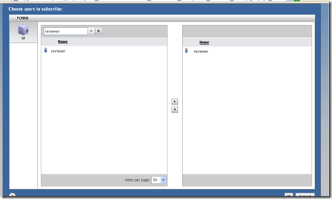
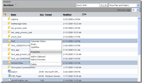
Any user can subscribe an object for another user. Here a document has been subscribed by dmadmin user for reviewer as shown below.
Option to enable Subscribe Others in Webtop

Select the user for which the object is to be subscribed
Now when user “reviewer” logs in to the repository, the object will be seen in the user‟s subscription list.
User can see the object in his subscription list 
7.8 Export to CSV
To export the metadata of the object to a csv file, select the object and on right-click, selet “export to csv”
Menu Selection
Select the columns to be exported
The excel file will be opened.
7.9 Read Notification
User can turn on the notification for an object, which will send the notification in his inbox and through mail whenever the document is read.
Menu Selection
Now when this document is viewed by any user, a notification will be received in the user‟s inbox who turned on the notification for this document.
Notification in Inbox 
7.10 Multi Objects Selection
It is possible to define lifecycle, permissions and common properties to multiple objects at once. Select the multiple objects and on right-click select properties
Multiple Objects selection
The properties component will list the common editable properties, lifecycle/permission for the multiple objects.
Properties Component
7.11 Resizable Columns
To make the columns resizable define the header columns in datagrid as shown in the code below. <dmf:datagridTh cssclass='databoundExampleRowFont' resizable="true"> <dmf:datasortlink name='sortcol1' label='Object Name' column='object_name' mode='caseinstext'/> </dmf:datagridTh> <dmf:datagridTh cssclass='databoundExampleRowFont' resizable="true"> <dmf:datasortlink name='sortcol2' label='Object Type' column='r_object_type' mode='text'/> </dmf:datagridTh> For custom listing classes, that does not extend doclist, add the following method in your component implementation public void onInit(ArgumentList args) { ... initColumnWidths(); } protected void initColumnWidths() { //replace preference_id_string with string to persist the preference //replace CONTROL_GRID with datagrid ID m_widthsHelper = new DatagridColumnWidthPreferenceHelper( this, preference_id_string, CONTROL_GRID;
} private DatagridColumnWidthPreferenceHelper m_widthsHelper;
Result in Webtop
Columns Resized
7.12 Display the toolbar
To display the toolbar modify the webtop/classic/classic.jsp In the jsp file, frame height of toolbar has been given as 0.Change the height of the toolbar frame and it will be visible. Make the following modification to classic.jsp in custom layer. Set String strRows = "0,*"; to String strRows = "22,*";


